Unlocking Engineering Excellence with KPIs
This listicle reveals eight essential software engineering KPIs your team should track in 2025. By monitoring these metrics, you can identify bottlenecks, streamline processes, and validate agile effectiveness. Understanding software engineering KPIs empowers data-driven decisions, optimizing performance and ensuring you're building the right product, efficiently. From cycle time to defect density, we'll cover key indicators that help teams improve and deliver value faster. Tools like Umano automate measuring, analyzing, and acting on these KPIs.
1. Cycle Time
Cycle time is a crucial software engineering KPI that measures the time it takes for a piece of work, such as a feature or bug fix, to move from the beginning to the end of the software development process. This typically encompasses the time from the initial coding stage to deployment in a production environment. Tracking cycle time allows teams to identify bottlenecks, optimize their workflow, and ultimately improve their overall development efficiency. By understanding how long different stages of the process take, teams can make data-driven decisions to streamline their operations and deliver value faster. This KPI is essential for any team looking to embrace agile methodologies and improve their responsiveness to market demands.
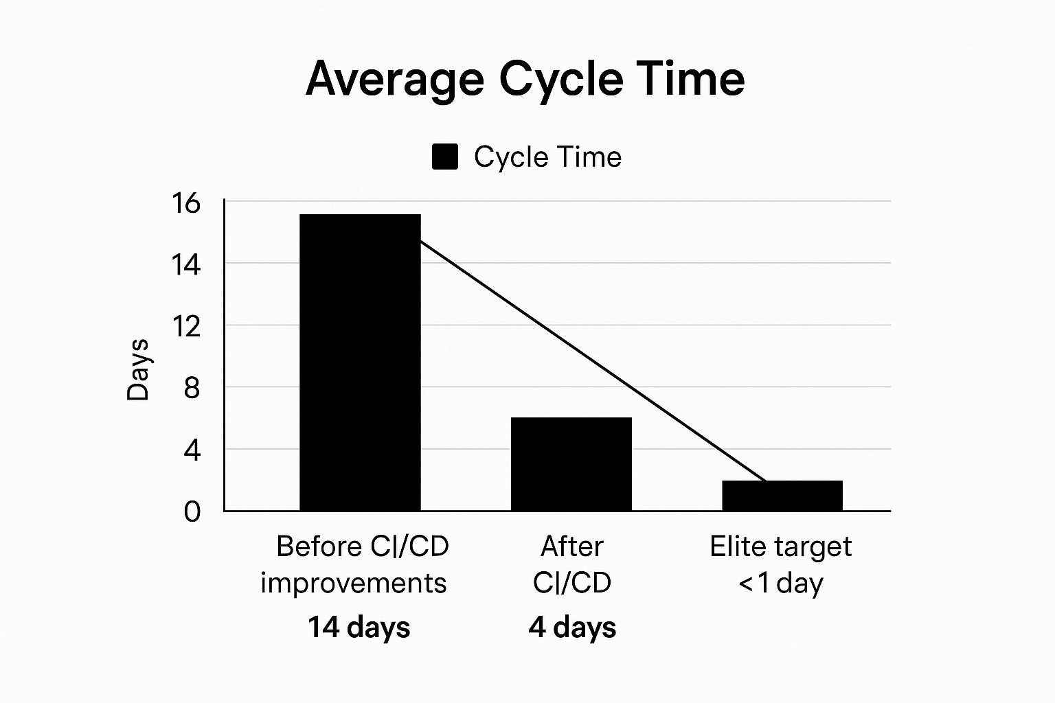
The infographic above visualizes the impact of optimizing cycle time. It shows a comparison of cycle time before and after implementing process improvements, breaking it down into key stages: coding, review, testing, and deployment. As you can see, optimizing each stage contributes to a significantly reduced overall cycle time. This chart clearly demonstrates the potential for improvement and how streamlining each step can lead to substantial gains in delivery speed.
Cycle time is often visualized using cumulative flow diagrams or control charts, which can reveal trends and variations over time. It's usually measured in days or hours and can be further broken down into individual stages such as coding, review, testing, and deployment to pinpoint specific areas for improvement. For example, if the testing phase consistently shows a longer cycle time than other phases, it signals a potential bottleneck that needs investigation. This granular approach allows teams to surgically address issues and achieve optimal efficiency. For example, Spotify successfully leveraged cycle time analysis to reduce their average cycle time from two weeks to just four days by implementing CI/CD practices and breaking down features into smaller, more manageable chunks. Similarly, both GitHub and Netflix actively monitor cycle time as a core metric to optimize their development processes and maintain a rapid release cadence.
Features and Benefits of Tracking Cycle Time:
- Tracks Time From Work Initiation to Completion: Provides a holistic view of the development process.
- Typically Measured in Days or Hours: Offers a quantifiable metric for tracking progress.
- Can Be Broken Down by Development Stages: Enables targeted optimization efforts.
- Often Visualized Using Cumulative Flow Diagrams or Control Charts: Facilitates trend analysis and identification of anomalies.
- Provides Clear Insight into Development Team Efficiency: Offers a direct measure of how quickly the team delivers value.
- Helps Identify Bottlenecks in the Development Pipeline: Pinpoints specific areas for improvement.
- Facilitates Accurate Project Timeline Predictions: Enables more realistic planning and forecasting.
- Correlates with Customer Satisfaction (Faster Delivery): Directly impacts the user experience by delivering value more frequently.
Pros and Cons of Using Cycle Time:
Pros:
- Increased Development Team Efficiency
- Identification of Bottlenecks
- Accurate Project Timeline Predictions
- Improved Customer Satisfaction
Cons:
- Potential Pressure to Rush Work
- Doesn't Account for Work Complexity Variations
- Possible Manipulation by Breaking Work into Artificially Smaller Chunks
- Requires Consistent Tracking Processes
Tips for Using Cycle Time Effectively:
- Break Down Cycle Time by Stages: Isolate specific bottlenecks and areas for improvement.
- Set Realistic Reduction Targets: Base targets on historical data and industry benchmarks.
- Combine with Quality Metrics: Ensure that speed doesn't compromise code quality.
- Use Automated Tools: Leverage tools like Azure DevOps Analytics or Jira dashboards for efficient tracking.
Popularized By:
- Lean software development methodology
- DevOps movement
- DORA (DevOps Research and Assessment) metrics
Cycle time deserves its place in the list of essential software engineering KPIs because it offers a highly effective way to measure and improve the speed and efficiency of the software development process. By focusing on this key metric, teams can optimize their workflows, deliver value faster, and ultimately increase customer satisfaction. This makes it a critical tool for any engineering manager, scrum master, or agile coach looking to enhance their team's performance. For Jira users, integrating cycle time tracking into their workflow becomes even more valuable, as it can be easily visualized and analyzed within the platform. This metric also resonates strongly with DevOps leaders and those working in Agile environments, where rapid iteration and continuous improvement are paramount. By understanding and utilizing cycle time effectively, organizations can gain a significant competitive advantage in today’s fast-paced software development landscape.
2. Deployment Frequency
Deployment Frequency, a crucial software engineering KPI, measures how often code is successfully deployed to production. This metric provides valuable insights into a team's ability to deliver small batches of work quickly and efficiently, reflecting the maturity of their Continuous Integration and Continuous Delivery (CI/CD) practices. A higher deployment frequency generally correlates with better team performance, faster feedback loops, and more responsive product development. Tracking Deployment Frequency helps organizations understand their development velocity and identify areas for improvement in their software delivery lifecycle. This makes it an essential KPI for anyone involved in software development, from engineers to product managers.
This KPI typically counts successful deployments to production over a specific time period, such as a day, week, or month. It is a key metric within the DORA (DevOps Research and Assessment) framework, which provides a widely recognized benchmark for measuring software delivery performance. Deployment Frequency is often analyzed alongside the change failure rate to provide a comprehensive view of delivery speed and stability. This combined analysis helps teams understand if they are sacrificing quality for speed, or vice versa.
Features and Benefits:
- Tracks Successful Deployments: Provides a quantifiable measure of how often code is released to production.
- Variable Timeframes: Can be measured per day, week, or month, allowing for flexibility based on project needs and team capacity.
- DORA Metric: Recognized as a key DORA metric, providing a benchmark for comparison against industry leaders.
- Agility Indicator: Reflects the engineering team's agility and ability to respond quickly to changing requirements.
- Promotes Smaller Code Changes: Encourages the practice of breaking down work into smaller, more manageable units, reducing risk and improving code quality.
- Automation Driver: Incentivizes the automation of testing and deployment processes, leading to greater efficiency and reduced human error.
- Business Responsiveness: Correlates with the business's ability to respond quickly to market demands and customer feedback.
Pros:
- Indicates engineering team agility and delivery capability.
- Encourages smaller, safer code changes.
- Promotes automation of testing and deployment.
- Correlates with business responsiveness to market needs.
Cons:
- Might encourage unnecessary deployments to meet targets.
- Not all products require frequent deployments.
- May need normalization by team size for fair comparisons.
- High frequency alone doesn't guarantee high quality.
Examples of Successful Implementation:
- Amazon: Deploys code to production every 11.7 seconds on average.
- Google: Performs thousands of deployments daily across its services.
- Etsy: Moved from biweekly deployments to 50+ deployments per day.
Actionable Tips:
- Automate First: Start by automating your deployment pipelines before focusing on increasing frequency.
- Gradual Increase: Gradually increase your target deployment frequency as confidence in your automated tests grows.
- Feature Flags: Consider using feature flags to decouple deployment from feature release, allowing for safer and more controlled rollouts.
- Balance with Quality: Balance deployment frequency with other quality and stability metrics, such as change failure rate and mean time to recovery (MTTR).
When and Why to Use This Approach:
Deployment Frequency is a valuable KPI for any software development team aiming to improve their agility, speed, and responsiveness. It's particularly relevant for teams working in agile environments, practicing continuous delivery, or aiming to optimize their DevOps practices. By tracking and analyzing this metric, organizations can identify bottlenecks in their delivery pipeline, improve their CI/CD processes, and ultimately deliver value to their customers faster.
Popularized By:
- DORA metrics and annual State of DevOps reports
- Jez Humble and Nicole Forsgren's research
- Continuous Delivery movement and Martin Fowler's writings
3. Mean Time to Recovery (MTTR)
Mean Time to Recovery (MTTR) is a crucial software engineering KPI that measures the average time it takes to restore service after a failure or outage. It's a key indicator of your team's ability to respond to incidents, the resilience of your systems, and a critical component of evaluating the effectiveness of your incident management process. For engineering managers, scrum masters, and DevOps leaders especially, understanding and optimizing MTTR is paramount for delivering reliable software and minimizing the impact of disruptions on users. MTTR is a valuable addition to any suite of software engineering KPIs because it directly reflects the speed and efficiency of your team's response to production issues.
MTTR tracks the time elapsed from the moment an incident is detected to the point when the service is fully restored and operational. This duration is usually measured in minutes or hours. A lower MTTR signifies better operational practices, a more robust incident response process, and more resilient software systems. In contrast, a high MTTR suggests potential weaknesses in your incident management procedures, monitoring systems, or system architecture itself. MTTR is also one of the four key DORA metrics for DevOps performance, highlighting its importance in modern software development practices.
How MTTR Works:
The calculation of MTTR involves summing the total downtime across multiple incidents and dividing it by the number of incidents. For example, if you have three incidents with downtimes of 30 minutes, 60 minutes, and 90 minutes, the MTTR is (30 + 60 + 90) / 3 = 60 minutes.
Features and Benefits:
- Tracks time from incident detection to service restoration: This provides a precise measurement of your team's responsiveness and efficiency.
- Usually measured in minutes or hours: This allows for granular tracking and identification of areas for improvement.
- Key indicator of operational excellence: A low MTTR demonstrates a mature and well-functioning incident response process.
- One of four key DORA metrics for DevOps performance: Recognized as a critical metric for high-performing DevOps teams.
- Directly relates to user experience during failures: Shorter outages mean less disruption for users, leading to higher satisfaction.
- Encourages building more resilient systems: Focusing on MTTR encourages proactive measures to prevent failures and minimize their impact.
- Promotes better monitoring and alerting systems: Effective monitoring and alerting are essential for rapid incident detection and response.
Pros and Cons:
Pros:
- Directly relates to user experience during failures
- Encourages building more resilient systems
- Promotes better monitoring and alerting systems
- Helps evaluate the effectiveness of incident response procedures
Cons:
- Doesn't account for incident severity differences. Minor and major incidents contribute equally to the calculation, which can be misleading.
- May encourage temporary fixes over proper root cause resolution in the pursuit of a quick recovery.
- Can be skewed by outlier incidents. A single, unusually long outage can disproportionately impact the average.
- Requires standardized criteria for when recovery is complete. Ambiguity here can lead to inconsistencies in measurement.
Examples of Successful Implementation:
- Google Cloud targets an MTTR under 10 minutes for critical services, demonstrating a commitment to rapid recovery and minimal user impact.
- Microsoft Azure reduced MTTR by 33% through automated rollback capabilities, showcasing the power of automation in incident response.
- Cloudflare documents their incident response and MTTR improvement efforts publicly in post-mortems, fostering transparency and continuous learning.
Actionable Tips for Improvement:
- Implement automated rollback capabilities: Quickly revert to a stable state in case of deployments causing issues.
- Create standardized incident response playbooks: Define clear roles, responsibilities, and procedures for handling incidents.
- Conduct regular chaos engineering exercises: Simulate failures to test your systems' resilience and your team's response time.
- Develop self-healing capabilities in critical systems: Automate recovery processes to minimize downtime without human intervention.
When and Why to Use MTTR:
MTTR should be used whenever you need to understand and improve your incident response process. It's especially relevant for Agile teams, DevOps practitioners, and SREs focused on delivering reliable and highly available software. Tracking MTTR helps identify bottlenecks, prioritize improvements, and measure the impact of changes to your systems and processes. By consistently monitoring and optimizing MTTR, you can create a more resilient and responsive system, minimizing the impact of failures on your users and your business.
4. Change Failure Rate
Change Failure Rate is a crucial software engineering KPI that measures the percentage of code changes causing failures, incidents, or rollbacks in production. This metric provides valuable insights into the effectiveness of your engineering practices, testing strategies, and the overall reliability of your deployment process. A lower change failure rate signifies higher code quality, more robust testing, and a more stable software delivery lifecycle, making it a vital metric for any software development team striving for operational excellence. This makes Change Failure Rate a critical KPI for understanding and improving the health of your software delivery process.
Change Failure Rate is calculated as (number of failed changes / total number of changes) × 100%. This calculation is typically performed over weekly or monthly periods to identify trends and track progress. As a core DORA metric for evaluating deployment safety, it is often segmented by change type, team, or service to pinpoint specific areas for improvement. For example, you might track the change failure rate for different feature releases, infrastructure updates, or individual teams. This granular approach allows for more targeted interventions and faster remediation of issues.
Why Use Change Failure Rate?
This KPI directly correlates with production stability and reliability. By monitoring and actively working to reduce your Change Failure Rate, you can significantly improve the user experience and reduce the costs associated with production incidents. It encourages better testing and quality assurance practices by highlighting the direct impact of insufficient testing on production stability. Further, Change Failure Rate helps evaluate the effectiveness of your CI/CD pipelines by identifying bottlenecks and areas where automation can be improved. It also provides early warning signs of technical debt accumulation. A consistently increasing Change Failure Rate can indicate that technical debt is hindering your ability to deliver changes reliably.
Pros:
- Directly correlates with production stability and reliability
- Encourages better testing and quality assurance practices
- Helps evaluate the effectiveness of CI/CD pipelines
- Provides early warning signs of technical debt accumulation
Cons:
- May discourage innovation if failure is overly penalized: Teams might avoid taking risks if they are overly concerned about impacting the failure rate.
- Requires clear definition of what constitutes a 'failure': Without a precise definition, the metric can become subjective and unreliable.
- Can be manipulated by making only safe, incremental changes: Focusing solely on small, low-risk changes can slow down development velocity and prevent important improvements.
- Doesn't account for the business impact of different failures: Not all failures are created equal. A minor UI bug has a significantly different impact than a complete system outage.
Examples of Successful Implementation:
- Google maintains a change failure rate under 5% for their core services.
- Capital One reduced their change failure rate from 28% to 8% through test automation.
- Target improved their change failure rate by implementing feature flags and canary deployments.
Actionable Tips for Improvement:
- Implement comprehensive automated testing: Include unit, integration, and end-to-end tests to catch potential issues early in the development lifecycle.
- Use feature flags: Decouple deployment from feature release, allowing you to test new features in production with a small subset of users before a full rollout.
- Practice canary deployments: Gradually roll out changes to a small portion of your user base to detect and address issues before they impact everyone.
- Conduct thorough post-mortem analyses after failures: Learn from every failure and implement changes to prevent recurrence.
Popularized By:
- DORA research team and their annual State of DevOps reports
- The book Accelerate by Nicole Forsgren, Jez Humble, and Gene Kim
- DevOps and SRE movements
Change Failure Rate provides a quantifiable measure of your software delivery performance. By tracking and actively working to lower this metric, you can improve the stability and reliability of your software, leading to a better user experience and a more efficient development process. Its inclusion in the list of essential software engineering KPIs is undeniable due to its direct correlation with production stability and its ability to drive continuous improvement in engineering practices.
5. Code Coverage
Code coverage, a crucial software engineering KPI, measures the percentage of your codebase executed during automated testing. This metric helps engineering teams, scrum masters, and agile coaches gain valuable insights into the thoroughness of their test suites and identify gaps in testing that could hide potential defects. While code coverage doesn't directly measure code quality, maintaining a high level of coverage provides confidence that code changes, particularly during rapid development cycles, won't introduce regressions or break existing functionality. This makes it a key metric for DevOps leaders and team leads in agile environments.
How Code Coverage Works:
Code coverage tools analyze your code and tests, tracking which lines, branches (conditional statements like if/else), and paths (combinations of branches) are executed during test runs. The results are typically expressed as a percentage. For instance, 80% branch coverage means 80% of the possible branches within your code were executed during testing. These results are often visually represented within IDEs and CI/CD pipelines using colored overlays (green for covered, red for uncovered) directly on the code itself, making it easy for software development teams to pinpoint untested areas.
Features and Benefits:
- Granular Measurement: Code coverage can be measured at different levels: unit tests (testing individual components), integration tests (testing interactions between components), and system tests (testing the entire application). This allows teams to assess testing thoroughness at various stages of the development process.
- Trend Analysis: Tracking code coverage over time provides a clear picture of testing progress and helps prevent regressions in test coverage. This historical data is particularly valuable for Jira users and Atlassian marketplace buyers seeking to integrate code quality metrics into their workflows.
- Testability Feedback: Striving for higher code coverage often encourages developers to write more testable code, a key principle of quality-focused software methodologies like Clean Code. This leads to more modular and maintainable codebases.
Pros and Cons:
Pros:
- Objective Measurement: Provides a quantifiable measure of testing thoroughness.
- Gap Identification: Highlights untested or under-tested areas of the codebase.
- Promotes Testability: Encourages writing more modular and testable code.
- Regression Prevention: Helps prevent the introduction of bugs during code changes.
Cons:
- Not a Guarantee of Quality: High coverage doesn't guarantee bug-free code or even that the tests themselves are effective.
- Potential for Misuse: Can incentivize writing tests simply to inflate the metric rather than writing meaningful tests that verify correct behavior.
- Testability Limitations: Some code (e.g., highly complex algorithms or code interacting with external hardware) can be difficult or impractical to test thoroughly.
- False Confidence: Can create a false sense of security if the quality of the tests is poor.
Examples of Successful Implementation:
- Google: Maintains 85-90% code coverage for critical services.
- Facebook (Jest): Maintains >90% code coverage for their Jest testing framework.
- Python's requests library: Maintains >80% coverage.
Actionable Tips:
- Prioritize Critical Paths: Focus on achieving high coverage for critical code paths and core business logic rather than aiming for 100% coverage across the entire codebase.
- Context-Specific Targets: Set different coverage targets for different types of code. For example, core libraries and critical modules might require higher coverage than less critical utility functions.
- Focus on Test Quality: Combine code coverage with mutation testing (which introduces small changes to the code to see if tests can detect them) to assess the quality and effectiveness of your tests, not just the quantity.
- CI/CD Integration: Implement coverage gates in your CI/CD pipeline to prevent merges that decrease coverage below a defined threshold, ensuring consistent testing standards.
Why Code Coverage Matters for Software Engineering KPIs:
Code coverage, while not the sole indicator of code quality, provides valuable insight into testing thoroughness and helps identify potential risk areas within a codebase. By tracking and improving code coverage, CTOs, product owners, and development teams can build more robust and reliable software, reduce the likelihood of regressions, and foster a culture of quality. Used effectively, code coverage is a powerful tool in the pursuit of delivering high-quality software.
6. Lead Time for Changes
Lead Time for Changes is a crucial software engineering KPI that measures the time elapsed between committing a code change and its successful deployment to production. This metric provides a holistic view of your software delivery pipeline's efficiency, revealing how quickly your organization can respond to evolving business needs and customer demands through software updates. It’s a key indicator of your team's agility and a critical factor in maintaining a competitive edge in today's fast-paced software development landscape. This KPI deserves its place on this list because it provides a high-level overview of delivery performance, allowing organizations to pinpoint bottlenecks and streamline their processes. For engineering managers, scrum masters, agile coaches, and DevOps leaders, understanding and optimizing Lead Time for Changes is essential for driving continuous improvement and achieving faster time to market.
How It Works:
Lead Time for Changes encompasses the entire software delivery lifecycle, starting from the moment a developer commits code to version control and ending when that change is successfully running in production. This includes all the intermediate steps like building, testing, integrating, and deploying the code. It is typically measured in hours, days, or weeks, with shorter lead times indicating a more efficient and streamlined process.
Features:
- End-to-End Measurement: Spans from the initial code commit to successful production deployment.
- Time-Based Metric: Typically measured in hours, days, or weeks.
- DORA Metric: Recognized as a key DORA (DevOps Research and Assessment) metric for evaluating software delivery performance.
- Granular Analysis: Often broken down into component phases (e.g., build time, test time, deployment time) for detailed analysis and bottleneck identification.
Pros:
- Holistic View: Provides a comprehensive understanding of the entire delivery process efficiency.
- Agility Indicator: Strongly correlates with organizational agility and the ability to respond quickly to market changes.
- Bottleneck Identification: Helps pinpoint bottlenecks and areas for improvement across the delivery pipeline.
- Improved Planning: Enables better planning and estimation for new features and releases.
Cons:
- Optimization Complexity: Can be challenging to optimize as it involves multiple teams, processes, and tools.
- External Factors: Can be influenced by factors outside of the engineering team's direct control, such as approval processes or infrastructure limitations.
- Variability: May vary significantly depending on the type and complexity of the change being implemented.
- Limited Scope: Doesn't account for pre-commit activities like design, planning, and requirements gathering.
Examples of Successful Implementation:
- Amazon: Has achieved remarkably low lead times, often under one hour, for many service changes, enabling rapid innovation and deployment.
- Etsy: Successfully reduced their lead time for changes from weeks to hours by optimizing their CI/CD pipeline and automating key processes.
- Netflix: Maintains impressively short lead times, typically under 24 hours, for most microservices, supporting their continuous delivery model.
Actionable Tips for Improvement:
- Breakdown Analysis: Break down the overall lead time into individual stages (e.g., build, test, deploy) to identify specific areas for improvement.
- Automation: Automate manual steps in the delivery pipeline, such as testing, deployment, and infrastructure provisioning.
- Feature Flags: Implement feature flags to decouple code deployment from feature release, allowing for faster and more controlled deployments.
- Streamline Approvals: Focus on reducing approval and waiting time between different stages of the delivery pipeline.
When and Why to Use Lead Time for Changes:
Lead Time for Changes is a valuable KPI for any organization that develops and delivers software. It's particularly relevant for teams adopting agile and DevOps practices, where rapid and frequent deployments are a key objective. Tracking and optimizing this metric helps organizations:
- Improve Delivery Speed: Accelerate the delivery of new features and bug fixes to customers.
- Enhance Agility: Increase responsiveness to changing business requirements and market demands.
- Reduce Risk: Minimize the risk of deployment failures and improve overall system stability.
- Increase Efficiency: Optimize resource utilization and improve the overall efficiency of the software delivery process.
Popularized By:
- Accelerate by Nicole Forsgren, Jez Humble, and Gene Kim
- DORA research and annual State of DevOps reports
- Lean software development principles
7. Technical Debt Ratio
Technical Debt Ratio is a crucial software engineering KPI that quantifies the proportion of a codebase requiring refactoring or improvement. For engineering managers, scrum masters, and development teams striving for sustainable velocity, understanding and managing this KPI is essential for balancing short-term feature delivery with the long-term health of the software. It provides a measurable way to track the accumulated technical compromises – the "debt" – that can slow down future development, increase bug rates, and hinder innovation. This makes it a valuable addition to any suite of software engineering KPIs.
This metric helps teams understand how much "interest" they're paying on their technical debt in the form of reduced development speed, increased bug fixing time, and difficulty implementing new features. By monitoring technical debt, teams can make informed decisions about when and how to address it, preventing it from becoming an insurmountable obstacle.
How it Works:
Technical Debt Ratio is often calculated as:
(Remediation Cost / Development Cost) × 100%
- Remediation Cost: Estimated effort (typically in person-hours) required to fix identified technical debt issues. This can include refactoring code, updating libraries, improving documentation, or addressing architectural weaknesses.
- Development Cost: Estimated effort (also in person-hours) required to build the current system or feature set.
The ratio represents the percentage of development effort that would theoretically be required to repay the accumulated technical debt.
Features:
- Calculated as a percentage, providing a clear, comparable metric.
- Measurable using static code analysis tools like SonarQube or CodeClimate, which can automate the identification of code smells, vulnerabilities, and other technical debt indicators.
- Trackable across sprints or releases to monitor trends and the impact of refactoring efforts.
- Breakable down by component, service, or code area to pinpoint specific hotspots of technical debt.
Pros:
- Makes the Invisible Visible: Quantifies the often-hidden cost of rushed development and technical shortcuts.
- Justifies Refactoring: Provides concrete data to support requests for resources and time allocated to refactoring and improvement efforts.
- Prevents Velocity Decline: Proactively addressing technical debt helps maintain a sustainable development pace and avoid the slowdown associated with code degradation.
- Data-Driven Decisions: Enables informed decisions about when to prioritize addressing technical debt versus delivering new features.
Cons:
- Measurement Challenges: Difficult to consistently and objectively measure remediation cost. Estimates can be subjective and vary based on team expertise and tools used.
- Limitations of Static Analysis: Automated tools may not capture all types of technical debt, particularly architectural issues or those related to code complexity that isn't immediately apparent through static analysis.
- Overemphasis on Measurable Issues: May lead to focusing on easily quantifiable issues while neglecting more complex, but potentially more impactful, architectural problems.
- Tooling Variations: Different static analysis tools produce varying results, making benchmarking and comparison across teams or projects difficult.
Examples of Successful Implementation:
- Google reportedly sets aside 20% of engineering time specifically for addressing technical debt, acknowledging its importance in maintaining a healthy codebase.
- Microsoft utilizes a technical debt dashboard to track and manage issues across its diverse product portfolio.
- Stripe successfully reduced their technical debt ratio from 22% to 7% through dedicated refactoring sprints, demonstrating the tangible benefits of focused effort.
Actionable Tips:
- Establish a Cadence: Dedicate a regular portion of sprint capacity (e.g., 10-20%) specifically to addressing technical debt. This ensures consistent progress and prevents debt from accumulating unchecked.
- Prioritize High-Impact Areas: Focus on areas with the highest impact on developer productivity and system stability. Address issues that are causing frequent bugs, slowing down development, or hindering new feature implementation.
- Utilize Objective Tools: Leverage static code analysis tools like SonarQube or CodeClimate to automate the identification and tracking of technical debt. These tools provide consistent metrics and can highlight areas needing attention.
- Foster a "Boy Scout Rule" Culture: Encourage developers to leave the code cleaner than they found it. Small, incremental improvements over time can significantly reduce the accumulation of technical debt.
Why This KPI Matters:
In the context of software engineering KPIs, Technical Debt Ratio offers a critical lens through which to view the long-term sustainability of a project. It aligns with agile principles by promoting iterative improvement and preventing the accumulation of problems that impede future progress. For engineering managers, product owners, and CTOs, this KPI provides valuable insights into the health of the codebase and allows for informed resource allocation decisions. By tracking and managing technical debt, teams can deliver high-quality software at a sustainable pace and avoid the crippling effects of unchecked technical compromises.
8. Defect Density: A Key Software Engineering KPI
Defect Density is a crucial software engineering KPI that provides valuable insights into the quality of your codebase and the effectiveness of your development processes. It measures the number of confirmed defects found in a piece of software relative to its size. Tracking and analyzing defect density helps teams identify areas for improvement, predict maintenance efforts, and ultimately deliver a better user experience. This makes it a vital metric for Engineering Managers, Scrum Masters, Agile Coaches, Product Owners, CTOs, Software Development Teams, Jira Users, DevOps Leaders, and Team Leads in agile environments.
How it Works:
Defect density is calculated using a simple formula:
Defect Density = Number of Defects / Size of Software
The "size of software" is typically measured in thousands of lines of code (KLOC) or function points. While KLOC is more common, function points offer a more abstract and potentially more accurate measure of software size, independent of the programming language used.
Features and Benefits:
- Objective Measurement: Defect density offers a quantifiable measure of software quality, allowing for data-driven decision-making.
- Comparative Analysis: Track defect density across different modules, teams, releases, or even against industry benchmarks to identify strengths and weaknesses. This is especially useful for Atlassian Marketplace Buyers evaluating different software solutions.
- Targeted Improvements: By segmenting defect density by severity level or component, you can pinpoint problematic areas that require immediate attention.
- Predictive Capabilities: A high defect density often correlates with increased maintenance effort and potentially lower customer satisfaction. Tracking this KPI can help you anticipate and mitigate these issues.
- Process Improvement: Analyzing defect density in conjunction with defect injection and detection rates can reveal weaknesses in your development and testing processes.
Pros:
- Provides an objective measure of software quality.
- Allows comparison between different modules, teams, or releases.
- Helps identify problematic areas that need more attention.
- Useful for predicting maintenance effort and customer satisfaction.
Cons:
- KLOC is an imperfect measure of software size and complexity.
- Doesn't account for defect impact or severity without additional analysis.
- Can be manipulated by not logging minor issues.
- Affected by differences in defect reporting processes.
Examples of Successful Implementation:
- Microsoft: Aims for a defect density below 0.5 defects per KLOC for released software, demonstrating a commitment to high quality.
- NASA: Achieved an exceptionally low defect density of 0.1 defects per KLOC for the space shuttle software, highlighting the importance of this KPI in mission-critical systems.
- JPMorgan Chase: Reduced defect density by 43% through improvements in test automation and code review processes, demonstrating the tangible benefits of focusing on this metric.
Actionable Tips:
- Normalize by Complexity: For more insightful analysis, normalize defect density by complexity or risk rather than just size.
- Track Injection and Detection Rates: Analyze defect injection and detection rates by development phase (e.g., requirements, design, coding, testing) to identify and address process bottlenecks.
- Root Cause Analysis: Don't just fix individual bugs. Use root cause analysis to identify and address systemic issues that contribute to higher defect density.
- Benchmarking: Compare similar components or applications within your organization or against industry best practices to identify areas for improvement.
When and Why to Use This Approach:
Defect density is a valuable metric throughout the software development lifecycle. Track it during development, testing, and even in production to gain a comprehensive understanding of your software quality. It is particularly relevant for projects with stringent quality requirements, large codebases, or distributed teams.
Popularized By:
The concept of defect density has been popularized by influential figures and frameworks in the software engineering field, including:
- Capers Jones and his extensive research on software quality.
- The CMMI (Capability Maturity Model Integration) framework.
- Steve McConnell's seminal book "Code Complete."
By incorporating defect density as a key software engineering KPI, organizations can gain valuable data-driven insights into their development processes, ultimately leading to higher quality software, reduced maintenance costs, and improved customer satisfaction. This metric holds significant importance for anyone involved in the software development lifecycle, from individual developers to CTOs.
Key Software Engineering KPI Comparison
| KPI |
Implementation Complexity 🔄 |
Resource Requirements 💡 |
Expected Outcomes 📊 |
Ideal Use Cases 💡 |
Key Advantages ⭐ |
| Cycle Time |
Moderate – requires consistent tracking and stage breakdowns |
Medium – tracking tools and process alignment |
Clear insight into workflow efficiency and bottlenecks; faster delivery |
Teams optimizing development pipeline and release speed |
Identifies bottlenecks; predicts timelines; improves efficiency |
| Deployment Frequency |
Low to Moderate – depends on automation maturity |
Medium – automated deployment pipelines needed |
Increased agility and delivery speed; frequent releases |
Mature CI/CD teams aiming for rapid, small batch releases |
Reflects delivery capability; encourages automation; boosts responsiveness |
| Mean Time to Recovery (MTTR) |
Moderate – incident tracking and response automation required |
Medium to High – monitoring, alerting, automated rollbacks |
Faster service restoration; improved reliability and user experience |
Operations teams focused on resilience and uptime |
Improves incident response; fosters system resilience; enhances user trust |
| Change Failure Rate |
Moderate – needs failure tracking and clear definitions |
Medium – testing automation and failure analysis |
Higher deployment reliability; improved code quality |
Teams emphasizing safe deployments and quality assurance |
Correlates with stability; highlights QA effectiveness; early risk warning |
| Code Coverage |
Moderate – requires comprehensive automated testing adoption |
High – test development and maintenance |
Better test suite thoroughness; reduces regressions |
Development teams driving test quality and maintainability |
Measures test coverage objectively; uncovers untested code areas |
| Lead Time for Changes |
High – spans multiple teams and pipelines |
High – requires pipeline automation and cross-team coordination |
Holistic delivery efficiency; faster response to business needs |
Organizations focusing on overall delivery speed and agility |
Holistic process visibility; identifies multi-stage bottlenecks |
| Technical Debt Ratio |
Moderate to High – needs static analysis and regular tracking |
Medium – tooling and dedicated refactoring time |
Improved long-term maintainability; controlled codebase quality |
Teams balancing short-term delivery with sustainability |
Makes hidden costs visible; supports data-driven refactoring decisions |
| Defect Density |
Moderate – defect tracking and size measurement required |
Medium – defect logging and analysis tools |
Objective software quality measurement; predicts maintenance effort |
Quality assurance and release management teams |
Enables quality benchmarking; identifies problematic areas |
Driving Continuous Improvement with Software Engineering KPIs
Effectively leveraging software engineering KPIs is crucial for any team striving for continuous improvement and high-performance software delivery. From cycle time and deployment frequency to code coverage and defect density, the key takeaways from this article highlight the importance of selecting and tracking the right metrics to understand your team's strengths and weaknesses. Mastering the use of software engineering KPIs empowers teams to make data-driven decisions, optimize development processes, and ultimately deliver higher-quality software faster and more efficiently. By focusing on areas like reducing MTTR, minimizing change failure rate, and managing technical debt, organizations can achieve significant improvements in their software development lifecycle, resulting in increased customer satisfaction and a stronger competitive edge. Remember that the goal isn’t just to collect data, but to use it to drive actionable improvements, fostering a culture of continuous learning and optimization.
Want to streamline your software engineering KPI tracking and analysis? Umano integrates with your existing tools to automatically collect and visualize these critical metrics, providing you with actionable insights to drive engineering excellence. Visit Umano to learn more and unlock the full potential of your engineering data.